Monday, October 18, 2010

Understanding Comics


As I read Scott McCloud's Understanding Comics, I have come to understand how comics are really comic art. McCloud explains what distinguish comic art from other art form and with that, he creates a principle that increase its value. Because to increase something's value, the item must decrease in quantity or increase in demand. McCloud’s definition increased the genre’s value by including some famous works of art by Hogarth and other artists to the genre. His definition also increased value by making comic art an exclusive genre, removing cartoons and other medium from the category.

Furthermore, McCloud explains the mechanics behind comic art. With that, he makes such works like Manga or X-Men much more significant than just the story they were drawn about. He explains the picture box, concepts of movement and time. These concepts show how even comic arts have rules that are used to deliver its message and story.

From reading his book, I’ve learned to have a greater appreciation for comic art. To me, it has given comics a sense of integrity that it did not have before. It allowed me to distinguish between the doodle of an amateur with what is considered to be true comic art. Now, the next time a read a comic book, I can see how each individual frame has worked to affect the entire story. For example, I see how the form of comics affects its audience. It gives them more control than any other form. It lets the reader move back and forth in time as he or she sees fit.

Comparison and Contrast


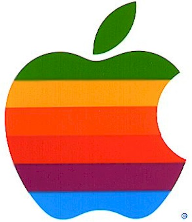
The evolution of the Apple logo shows the passage of time and technology. In its beginning, the logo was simple graphic referencing the forbidden fruit from the tree of knowledge. Other than the stripes of color filling the bitten apple shape, there are no embellishments. However, the Technicolor shows the rise of technology. It reminds us of color televisions and computer graphics of the sixties. As the time changed and technology advanced, Apple needed a change. Their new logo needed to show the new direction in which the company was moving. Aesthetically, Apple was now sleek, clean, and minimalist. With that philosophy their logo changed to match. Apple’s logo is now three dimensions with clean gradients and shading. It is monochromatic and metallic, showing a futuristic look to match the advances in its technology.


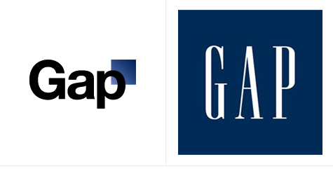
What makes Apple’s change different from Gap’s. The change was congruent with a change in the company. It was also made in the computer industry, where thing were always changing. However, for Gap, it’s brand was it’s only value. The company is one of hundreds that boasts and sell similar items. What gives it’s product appeal, is the brand that the company has bought with celebrity endorsement and advertising. The only thing that distinguishes its product is the recognizability of the brand. To change their iconic image would change the perception the company has created for itself. The classic and sophisticated image that came with the original logo was erased when it was replaced with a generic and scientific font.

Sunday, October 17, 2010

Design as Conversation


How is Design a conversation? It is an interaction between the work and its audience. It is like all conversation and provokes a response. A work of design provokes its audience to act. It initiates an idea and leads us down a path it has designated. To do this, it uses its forms, colors, and composition to compel us. It draws from our knowledge and emotions to nudge us into the right directions. Like a sinuous line drawing our gaze a focal point in a figure, design pulls a single thought from the haze in our minds.

In return, the audience acts.  We buy, we sell, we consume, we move, we use, we work, we dance, and we react to what the design has drawn from us. We are not without control but have only appeased the desire that design instilled in us. Even more, we imbue significance to the design. Our memory links our actions to our thoughts and the work becomes forever a part of our past. As we look at design once more in another time, it provokes a whole new set of thoughts that brings us to a completely different set of actions. The conversation between design and its audience continues.

True design does this. Whether it is for aesthetic appeal or functionality, a work of design can strike up a conversation. A dress can conjure desire between man and woman. The design brings a man close; it brings out beauty, and it makes him act. And as he act, the dress becomes part of the memory. Each element stands out even clearer as it links his action to the object that made him do it.

The conversation of design can be small or infinite. We can choose to act or not and end the conversation there or we can move forward and let our induced desire surface. And at each instances in time there will be a new thought that design can pull from, and from that, the possible outcomes can be infinite.

Monday, October 11, 2010

Designing Technology


How is designing technology different from designing anything else? To design for technology, there must be a lot of things one must consider. Designers must take into account the function, how the technology will be used and the feasibility of the design. With such restrictions, many may think that coming up with something great is difficult. However, there are a lot of great design in the world of technology.

Take for example the Apple Ipod. The original white iPod with the click wheel has become an iconic image for portable music player. For the most part, it is so because of the prevalence of the music player in our culture. Everyone has an iPod. But another reason for this is the iPod’s design. It was simple and recognizable. It took use of simple geometric shape that everyone knew and created a context for it. The gray wheel, white body and black screen have become instantly recognizable. Not only did it look elegant, it took into account the technology. The design took little space and increased efficiency. The designer/engineer reinvented the wheel and made it another tool to move around with, this time in the digital world.

Even now, with new wave of music player, nothing has come close to taking this icon’s place as the symbol for portable music player. This was a perfect example of designing technology. The designer took all aspect of the technology to consider his design. With a new product, the designer used classic shape. He made it easy to understand and so easy to remember.

Creativity From Without


Einstein once said, “Imagination is more important than knowledge.” However, to me, there can’t be imagination without knowledge. What is imagination but a manipulation of the real world? If one considers imagination as creativity, creativity is then a manipulation of the outside world. The sources of creativity are the things around us. It is nature, it is machines, and it is people.

Artists and designers put the world into their creations. They use leaves, branches, cups, trash, and almost anything they could find. They find inspiration from the forms and colors. They take the beauty they see in these thing and they try to enhance it through their work.

Take Deborah Butterfield, an artist from UC Davis who took with her, her experiences with horses and made it her art. Using different mediums such as wood and steel that she found inspiration from, she created sculptures of horses. However, unlike other artists she found more inspiration in the tranquility of the horses and chose only to create her sculptures with a resting pose. The horses were never galloping or jumping but always calm and still. She saw the beauty of the horse in such poses and chose that to be the subject of her work.

Inspiration usually takes the form of appreciation. Artists and designers are inspired by the beauty they see in life. They take these forms of beauty and tries to show it to the world, enhancing it so that the audience can appreciate the same thing they are.

Sunday, October 10, 2010

Stone Soup


As a child, I had only heard of Stone Soup. The first time I heard the story was the day I experienced Stone Soup for myself. It was an interesting experience, seeing how everyone collaborated to create something new and unique. As Housefield suggests, the exercise does bring out a sense of teamwork and teaches everyone how to use the skills and contribution of everyone to create something great.

For me, it was a great lesson in teamwork as well as a lesson in design. The experience made me consider whether what we were doing design or not, or if it was, was it good design? In my other collaborative work, there has always been a goal of some sort. And with that, the group was able to have a uniting vision and contribute what they thought would be best. However, with this experience there wasn’t a particular goal other than to create something. This made it difficult for everyone to work together to create something as one. When I looked around, I saw many people having the same experience. As I looked at the works of everyone, I asked, “How is this not just a smorgasbord of random things?” And as I mentioned before, to me there is no design without function, and for this particular instance, there is no design without purpose. Anyone can almost see beauty in anything; it is only a matter of preference. However, with purpose, the creation can show the audience something new, something the viewer did not have to create for themselves. Were all the works of Stone Soup day design, or good design? I’ll let the readers decide for themselves


.

Monday, October 4, 2010

What is Design?

What is Design? Many say it’s art. To me, it’s more and sometimes, it’s better. To simplify, Design is art with a function.

I look around and I see design everywhere: the symbols on my keyboard, the graphics on my computer, and the computer itself. The list could be infinite. The design of these items adds to it’s function. Many of the symbols on keyboards have become synonymous with the functions the key provides. There is design in a simple pair of scissors. The handle is designed so that it can be held effectively. Design helps society improve. Design tries to create new ideas. Design is a necessity.

Is Design a noun or a verb? As said in class, it is both. It can be the act of designing, imagining or it can a product of design, an image from your imagination. It’s something elusive that almost can’t be defined. It’s the past and present; it the known and unknown. Although the definition may be elusive, design itself is simple. It’s function. To start designing, one must ask what we want the design to do. With no function there cannot be design. That is why I say design is more than art. Art has become somewhat useless. It may have a point but almost no function. Modern art may show a critique on society or a point of view of some kind but it doesn’t function in a sense that it is need. It’s extra. There may be design in art, but it is not design.

Sunday, October 3, 2010

Font of the Futura


Futura, a timeless font that I find myself using more and more. What makes it special? It's clean and crisp. It's professional and fun. It's a mix between Comic Sans and Times New Roman. It is straightforward and efficient, using classic geometric shape with almost no embellishment. It follows the minimalist design philosophy that I find missing in a lot of things we see today.

However as I admire the design of Futura, I realize that to truly appreciate what Futura does, you must appreciate all fonts in general. Though you may prefer one font over another, the main purpose of the fonts remain the same. The font is an important part of the message and sometimes can be just as important as the message itself. In addition to making the words look better, it provides a visual aid to the presentation of the message. Imagine a wedding invitation written in Comic Sans rather than calligraphy or a birthday card written in stencil. The intention of the writer would have changed and the message, though the same would have been different.


Fonts are another façade of language and communication. It has become an essential part of today’s use of design. It can convey meaning beyond the words. Marketing and advertising uses fonts to give meaning through connotations to its meaningless brand. Kleenex uses a plush and round font to show softness and comfort, while IBM uses a patterned serif to show professionalism.

As we write our next piece of text, we must look at significance of our choice in font and how it has affected our message.

My Standout Memory


Its difficult to find first memories and even more difficult to dig through and distinguish between them. When asked to give my first positive memory of the impact of design in our lives, I can only see the one that stands out most.

It was a large landscape print of a lake and mountains. It was framed in plastic and under glass. It might have been of a painting or illustration or photograph, I’m not sure. The image was set at dusk where the various mountains in the horizons were various shades of dark blue. The lake in the foreground seem to melt into the back as one blue transitioned to another. A hint of pink highlighted the sky. At the time, it appealed to me with its subtlety. The scene was serene, the colors were calm, and the sight was beautiful. There was only blue, but the different variations made it interesting. Looking back now, I realize a larger significance to the picture. It was a generic print created to be a simple decoration in the home. Unlike any other piece of furniture, there wasn’t anything that made it physically special. The paper on which it printed was probably cheap and the ink it was print with was probably low quality. Yet, through the use and combination of simple colors and lines, it appreciated the value of the wall and home it hung in.


The image is design without embellishment. It used little resources to do relatively much more. At the most abstract level, the image added an atmosphere to the room, creating a sense of quality and class. It used basic lines and colors to draw these emotions and ideas. At the simplest level, it gives balance or a focal point to what would be an uninteresting wall. Design at its best is function on multiple levels. It is making the most out of what was given. It is more than just art; it is also ingenuity. 

Though the image was never a loud part of my past but it persisted in my memory. As with many good design, its qualities only stands out as one looks back on it. Even now, though the image is not vivid in my mind, its design is still clear and purposeful.


Though not the same image, it is very similar and gives the same feel.