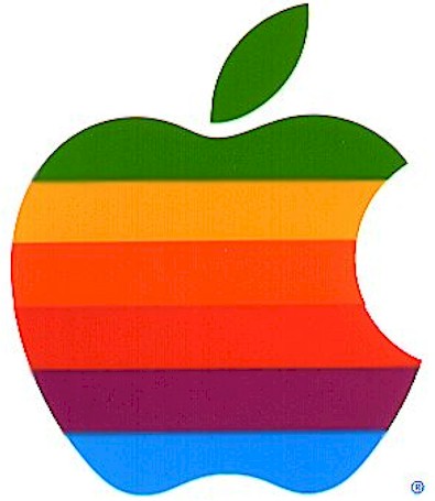
The evolution of the Apple logo shows the passage of time and technology. In its beginning, the logo was simple graphic referencing the forbidden fruit from the tree of knowledge. Other than the stripes of color filling the bitten apple shape, there are no embellishments. However, the Technicolor shows the rise of technology. It reminds us of color televisions and computer graphics of the sixties. As the time changed and technology advanced, Apple needed a change. Their new logo needed to show the new direction in which the company was moving. Aesthetically, Apple was now sleek, clean, and minimalist. With that philosophy their logo changed to match. Apple’s logo is now three dimensions with clean gradients and shading. It is monochromatic and metallic, showing a futuristic look to match the advances in its technology.
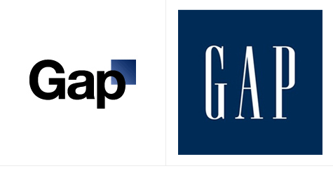
What makes Apple’s change different from Gap’s. The change was congruent with a change in the company. It was also made in the computer industry, where thing were always changing. However, for Gap, it’s brand was it’s only value. The company is one of hundreds that boasts and sell similar items. What gives it’s product appeal, is the brand that the company has bought with celebrity endorsement and advertising. The only thing that distinguishes its product is the recognizability of the brand. To change their iconic image would change the perception the company has created for itself. The classic and sophisticated image that came with the original logo was erased when it was replaced with a generic and scientific font.


No comments:
Post a Comment