Monday, November 29, 2010

Color Transform


How can color transform a single design? Color is probably the most basic of all elements in design. Yet it can do the most. Color evokes feelings, thoughts and emotions. Just as how society have assigned meanings to color such as being green or red communist, design uses some of the original meaning in color to make its point. For example, a designer may use red for anger, love or passion. When used correctly the color used can define a design.


Like the image described in my first blog, the monochromatic palate of the image give a sense of serenity. The somber shades of blue bring you down from your agitated state. It is a cooling feeling. Had the image been made with shades of red or orange, the image would have had a completely different affect. The image would have created a warmer feeling and perhaps evoke a warm and cozy feeling in the house rather than a classy and expensive one.

Again, color can transform a design significantly. The juxtapose of contrasting colors can change your mood dramatically. Had the image been using a larger color scheme and been busier, the effect would have been completely different.

Design in Society


Most design today cannot be considered utopian because it is based on a selfish motive. For the most part, modern design has been a form of competition. Companies try to out do each other and try to push out something new to gain customers. Though these designs may in the benefit society, it was not meant to. It was simply meant to increase sales. To see a truly utopian design, one must look back to the days where everything wasn’t about profit, a time where creativity was its own reward.


The renaissance is this time. I think one of the utopian designs is from the famous Leonardo DaVinci. Some of his invention/design were solely created out of creativity. There was no real motivation but to improve society. Such as his flying machine design was a way for people to travel. DaVinci had no intent to sell his design. He only wanted to design something innovative and helpful.

The renaissance was a time of pure creativity. It was then when western culture made its second big jump to modern culture. Unlike the industrial revolution where much of the design were made for monetary purposes, the designs of the renaissance was about, art, science, and the exploration of the new.

Design is Dangerous

Design can become dangerous when has become solely about aesthetic appeal. Society is beginning to forget the true idea behind design. Design should be first and foremost about function. When design becomes only about aesthetics, there is no longer quality. People will continue to look for new and better things without realizing that perhaps what they already have can do all that needs to be done.

Take for example a designed building. If people ever forget the function of the building and is only looking at the aesthetic aspect of the building, they will try to build another one. The time and money wasted on designing and creating new products to satisfy am aesthetic need is a dangerous concept.


When the time comes for when chairs lose their four legs in order to fit some kind of aesthetic ideal is a time when design has become dangerous.  Because the fact remains, the four legs were part of the design for function. Once it is removed to make it aesthetically pleasing, it defeats the purpose of having it. Even if the design can still be used as a chair, it is adding to a design that is already at its simplest form. Any addition would not be needed and would be a waste.

Monday, November 15, 2010

Designing Cartoons

What are the constraints that come into play when designing a cartoon show or character? What are the questions that are asked and how are they answered. First lets compare the design of two popular cartoon series and how their visual differences. What are the differences between The Simpsons and Family Guy?


One important difference is how the characters look. The characters of The Simpson are more comical and less realistic. Almost everyone has yellow skin and having blue hair is as normal as being a red head. They have circle and dots for eyes and their hairstyle can’t be seen anywhere else. Family Guy’s characters though still, comical look a little bit more realistic. How does this aspect affect its content? We can view this a design to target a different audience. The unrealistic design of The Simpsons is targeted more for a younger audience. They are more likely to accept and appreciate the image. Family Guy on the other hand is designs more for the older audience. They need to believe that they are watching something that is in lined with their maturity. The contents of these show clearly shows the differences between the two kinds of audience. Family Guy has much more violent topics and adult humor. The Simpsons however are more about cultural reference, which almost anyone would know about.

Ergonomics of a Chef’s Knife


The chef’s knife is an ergonomics design. It has little purpose other than it’s physical function to cut food. Its form must work to assist this function. Since there is more to it than just a sharp blade, we can imply there is design. What are the designs that make this object different from anything with a sharp blade?

Safety:
Aside from the fact that the object is a knife, the design is safe to use. The handle allow for continuous use without discomfort. It is form fitting to the user’s hand and allow for comfortable grip without continuous readjustment. The dull side of the blade is dull. This offers the user another way to stabilize the blade without hurting yourself. Finally the handle of the knife is much heavier than the blade itself. This gives the user better control and keeps the sharp and pointy from going astray.

Comfort:
Part of its safety is its comfort. The knife is used with repeated chopping motion and its design addresses this. The blade is curved. This allows the user to rely on the cutting board to do some of the work. When cutting using the curved blade, the user could be using a rocking motion instead of a chopping motion. This may reduce time and effort greatly. And again, the grip of the handle allows for better comfort. It provides a fitted grip that doesn’t need readjustment.

Ease of Use:
The knife is a pretty self-explanatory object. The user simply needs to hold the handle and start cutting. They have to be able to maneuver it correctly without hurting themselves and the design help them do this. The weighted handle allows for better control and grip. This will help avoid accidents if the user is not used to using knives.

Performance:
This knife is designed for maximum performance. It needs to be sharp, allow for long time use, and be somewhat versatile. Its design addresses this. The blade’s sharpness is a matter of production. It’s design, however, addresses the issue of long term uses. It has the fitted grip with plastic padding. This allows the user to keep using the knife without discomfort. The curved blade allows a rocking motion that gives the user more reliance on the knife itself than his movement. The dull side of the blade allows the user another way to stabilize the blade when using it. It also allows the user to apply extra pressure if they cannot achieve by just pushing down on the handle.

Aesthetics:

Finally, the knife is aesthetically pleasing. It has a contrast between the blade and handle. It also has silver accents on the handle. The use of simple colors and contrast gives a clean and modern feeling. The clean look is congruent with food cleanliness and the modern look is congruent with the idea of technology. It gives the impression that the blade has a special design that makes it sharper than average. It implies that special technology was used to make the knife have better performance.

Monday, November 8, 2010

UC Davis Design


What is UC Davis’ design. What is the theme that the offices on campus have. What are the unifying elements that we see when we look at the many advertisements, publication and flyers of the many different department within campus. We see the repetition of blue, gold and white. We see the use of nature and it’s interaction with Davis citizens. We see the transition between green to gold as the leaves on the picture change colors in the fall. These elements are seen over and over again and it has become a signature for UC Davis.


What does these elements tell us about UC Davis. It tells us that UC Davis is nature friendly. The images brings us back to a sentimental time and shows us that UC Davis can be an inviting, warm, and cozy place. It shows how UC Davis provides a tight knit education that isn’t the cold and sterile lecture halls we see elsewhere. It also reminds us of tradition and wholesome values. It makes use believe that UC Davis is similar to the historic “Ivy” Leagues.

Now, I find myself trying to incorporate this to my designs for technology advertising. I have to find away to make this feel of tradition merge with the feel of modern and style. I find this funny how there is a dichotomy of ideas.

Word & Image in Advertising


Advertising main goal is for the consumer to buy. It requires the delivery of a message either through picture, words or both. With pictures, advertising creates an image. It invokes an abstract representation that you refer to when you think of the object in question. Most times the pictures use the meaning we have in our heads and expand them to incorporate the item.


With fashion advertisement, pictures give us an image of perfection, class, and beauty. It shows us the unattainable and tells us how to attain it. It does this with the combination of its words and picture. The brand and picture interact to provide this unattainability and attainability. The image gives the image the abstract ideal of unattainability while the brand gives the consumer something to reach for. The advertisement may also include a slogan or tag. This further adds to the idea of attainability. The words are something we can see, say, and hear, and we only need to buy the product to get our senses fulfilled. The slogan also weaves a story we might already have in our heads. It cements our connection between the memory we have relating to the image and the brand.

Word & Image in Mom’s Cancer


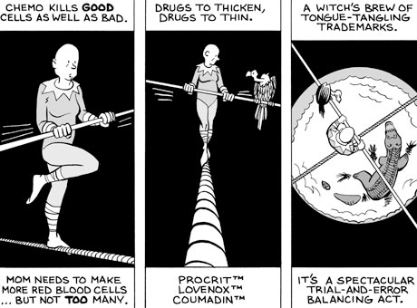
How does the words and image in Mom’s Cancer interact to tell Brian Fies’ story. Mom’s Cancer deals with serious issues. It talks about mortality. It talks about family. It talks about the challenges people go through when they are faced with a situation with no options. But how can it convey its message seriously when the images of the graphic novels are of lighthearted cartoon people.


It does this with the words that Fies chose to use. He carefully use a tone reflects both the lightheartedness of his image as well as the tragedy of his story. For the most part, these words are focused on the story of his mother and her situation, while the pictures showed the perception of these events as one tries to cope with it. When we read the caption that goes along with his comical images, we are able to realize the severity of the issue and see the emotions Fies might have had when he drew the image. We see that Fies is not trying to tip toe around the true story of his mother’s cancer but rather trying to share his thoughts and emotions on a deeper level.

Monday, November 1, 2010

Technology Changing Design


There is a battle in our society between the traditional and the modern. The most prevalent is the advancement of technology and how it is working to replace all things old-fashioned. Color TV has changed to Plasma. Plasma has turned to LCD. And LCD has now turned to 3D. And with the advancement of technology, the design for them has changed as well.

Before computer technology, form and function was the dominant interaction in design. Like the film Objectified discuss, if an alien were to land on our planet and saw a spoon, a knife, or a fork, one could say with some certainty that the alien would be able to guess what the object was. Even if the alien was unfamiliar of our society, the form in which these utensils were design was based on its function. If one look at computer on the other, this is not the case. When an alien is first looking at a computer, it cannot guess what the function is. Only after when it is able to turn it on and interact with the interface can it guess the function of the computer. With that said, technology makes it so that design is no longer restricted to form and function. It creates an entirely different concept that has now been called interaction design. The concept which pertains to objects that require interaction. And without interaction there can be no function. This brings us back to the idea of form and function. If interaction is an extension of function, technology still follows the general concept of design based on function.


Revisiting the iPod

Considering how form and content must interact in order to achieve “Design,” how has the iPod done this? As mentioned in the film, Objectified, the age of technology seems to be the point in which the inherent connection between form and content seems to divide. How can one infer function from an iPhone, a DVD Player, or an X-Box. Does this mean design with function in mind is no longer necessary?


The Apple IPod does achieve “Design” and does so by making physical function an equal partner with digital function. The original white iPod with the click wheel has become an iconic image for portable music player. It was simple and recognizable. It took use of simple geometric shape that everyone knew and created a context for it. The gray wheel, white body and black screen have become instantly recognizable. Not only did it look elegant, it took into account the technology. The design took little space and increased efficiency. The designer/engineer reinvented the wheel and made it another tool to move around with, this time in the digital world. The iPod almost completely eliminated buttons and relied solely on the natural behavior of the hand. All the digital actions the scroll wheel makes seems to be analogs of the maneuvers itself.

Although the iPod does not directly communicate form with content, it has created an innovation that made this particular form and content existent. Now almost all music player use this form and in doing, creates a form and content interaction which was originated by the Apple Ipod.

Form & Content: Objectified

In the film Objectified, Gary Hustwit discuss the interaction between form and content. What determines form and how does form imply content? These questions are asked again and again throughout the film as it asks designers of different perspectives and culture to look the ideas behind design. As Hustwit asks the different personalities of the industrial design industries, the viewer begins to see how the product we see everyday take shape and the idea that made it the way it is.


As seen by the toothpick, the peeler, and so many other things, form is predominantly determined by the function of the object. And whether the purpose of the design is for maximum functionality, comfort, or aesthetic, the form must be seamless and fluid. One must able to use the design without thinking about it. The design must be able to bypass conscious thought and appeal to our subconscious and automatic actions. It is when the user cannot accept the design of form that we understand the design is flawed. To see the design as a design, one must remove it from its functionality and to do this without conscious thought would mean the design had no significance to begin with. Even if the design was meant for aesthetic appeal, if it serves a visual function, no question would arise about its purpose. It’s presence would be accepted and no further thought would be needed.

In the film, this thought is repeated over and over. The idea of the film seems to show that design is at its best when there is no perceived design. It shows that form is only an extension of content, and if one cannot determine one from the other, there must be something wrong.